Why Mobile-Friendly Websites are Essential in Tanzania
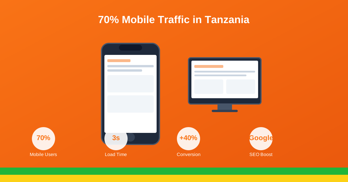
In Tanzania, mobile devices aren't just an alternative way to access the internet – they're the primary way most people get online. If your website isn't mobile-friendly, you're missing out on the majority of potential customers.
Mobile Usage Statistics in Tanzania
The numbers tell a compelling story about mobile usage in Tanzania:
- 75% of web traffic in Tanzania comes from mobile devices
- 29 million mobile internet subscribers as of 2025
- Mobile-first nation: Many Tanzanians have never owned a desktop computer
- Smartphone adoption continues to grow at 15% annually
- Average daily mobile usage: 4.5 hours per person
These statistics make one thing clear: if your website doesn't work well on mobile, you're effectively excluding three-quarters of your potential audience.
What is a Mobile-Friendly Website?
A mobile-friendly (or responsive) website automatically adjusts its layout, content, and functionality to provide an optimal viewing experience across all device sizes – from smartphones to tablets to desktop computers.
Key Characteristics of Mobile-Friendly Websites:
- Responsive layout: Content reflows to fit any screen size
- Touch-friendly: Buttons and links are easy to tap
- Readable text: No need to zoom in to read content
- Fast loading: Optimized for mobile networks
- Simplified navigation: Easy to use on small screens
SEO Benefits of Mobile-Friendly Design
1. Google's Mobile-First Indexing
Since 2019, Google primarily uses the mobile version of your website for indexing and ranking. If your mobile site is poor or non-existent, your search rankings will suffer – even for desktop searches.
2. Better Search Rankings
Mobile-friendliness is a confirmed ranking factor. Websites that work well on mobile consistently outrank those that don't in search results.
3. Lower Bounce Rates
Mobile users quickly leave websites that are difficult to use on their devices. A responsive design keeps visitors engaged longer, signaling to search engines that your content is valuable.
4. Local SEO Advantage
Mobile searches often have local intent ("near me" searches). A mobile-friendly site helps you capture this valuable local traffic.
Business Benefits of Mobile Optimization
Increased Conversions
Mobile-optimized websites convert visitors into customers at significantly higher rates. When users can easily navigate, read content, and complete actions on their phones, they're more likely to make purchases or inquiries.
Competitive Advantage
Many Tanzanian businesses still don't have mobile-friendly websites. By ensuring yours works perfectly on mobile, you gain an immediate advantage over competitors.
Better User Experience
A positive mobile experience builds trust and credibility. Users are more likely to return to and recommend websites that work well on their devices.
Social Media Traffic
Most social media usage in Tanzania happens on mobile devices. When users click links from Facebook, Instagram, or WhatsApp, they expect a mobile-optimized experience.
Common Mobile Website Mistakes to Avoid
| Mistake | Why It Hurts | Solution |
|---|---|---|
| Tiny buttons/links | Hard to tap, frustrating users | Make touch targets at least 44x44px |
| Slow loading | Users abandon after 3 seconds | Optimize images, use caching |
| Horizontal scrolling | Poor user experience | Use responsive layouts |
| Unplayable content | Flash doesn't work on mobile | Use HTML5 for media |
| Intrusive popups | Google penalizes, annoys users | Use mobile-friendly alternatives |
How to Make Your Website Mobile-Friendly
1. Choose Responsive Design
When building a new website or redesigning an existing one, insist on responsive design. All websites we build at Primezone Solutions are mobile-first and fully responsive.
2. Optimize Images
Large images slow down mobile loading. Use compressed images and modern formats like WebP. Implement lazy loading so images only load when needed.
3. Simplify Navigation
Mobile screens are small. Use hamburger menus, collapsible sections, and prioritize the most important navigation items.
4. Test on Real Devices
Don't just rely on browser resizing tools. Test your website on actual smartphones and tablets to ensure everything works as expected.
5. Use Mobile-Friendly Forms
Forms are often the biggest friction point on mobile. Use appropriate input types (email, tel, number), minimize required fields, and make submit buttons prominent.
Testing Your Website's Mobile-Friendliness
Use these free tools to check how mobile-friendly your website is:
- Google Mobile-Friendly Test: Official Google tool
- Google PageSpeed Insights: Tests speed and mobile usability
- BrowserStack: Test on various real devices
- Chrome DevTools: Built-in device emulation
The Cost of Not Being Mobile-Friendly
If your website isn't mobile-friendly, you're likely losing:
- 75% of potential traffic – mobile users who bounce immediately
- Search rankings – Google ranks mobile-friendly sites higher
- Conversions – frustrated users don't become customers
- Credibility – outdated websites hurt your brand image
Conclusion
In Tanzania's mobile-first digital landscape, having a mobile-friendly website isn't optional – it's essential. The investment in responsive design pays dividends through better search rankings, higher conversions, and improved customer satisfaction.
Is your website mobile-friendly? Contact us for a free mobile usability audit and recommendations for improvement.
Get a Mobile-Friendly Website
All our websites are built mobile-first and fully responsive.
View Web Design ServicesPrimezone Solutions
Mobile-First Web Design Experts